EDGE announces the completion of The Seven Gym project.
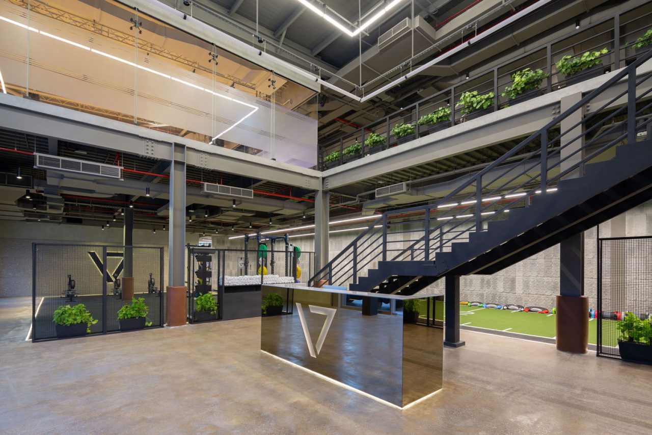
With the sport ethos, such as motivation, hard work and perseverance at the forefront of their company’s culture, EDGE Architects has once again brought the client’s vision to life.
“The design of the seven gyms is unique, enriched with a touch of luxury, which creates an extraordinary blend of finesse and roughness. We are lucky to work with clients whose goal is to establish a new standard in what the industry offers “- Milica Jevtovic Senior Interior designer at EDGE. The Seven Gym has its own identity, and designers have followed only one eternal trend – originality. Reacting with the imagination of the features of the site, EDGE created a clear sense of the place. They maintained a constant style of design and a general palette of materials that draw inspiration from contemporary art and modern design, not from the fitness sector. “The main goal was to give materials, colors and textures a full exposure and preserve them in a natural form. To emphasize the luxurious atmosphere, we put a special emphasis on the details. “Ali Aloulu, senior interior designer EDGE.
The elegant features proudly contradict the rough and raw materials throughout the gym, yet together they create the perfect balance between natural materials such as wood and leather versus the industrial finishes using different types of concrete, stone and metal.
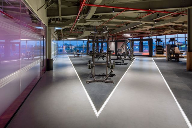
The high-end gym equipment is also a part of the design. All work out machines come in a special glitter metal coating and bespoke custom-made brown leather seats, and to make the design consistent matching brown leather is used to cover columns between the workout sections.
The floors’ uneven concrete texture is in keeping with the studio’s design ethos of using modest materials in novel ways. The rose gold reception desk creates a stylish-chic sharp touch to the white handcrafted concrete tiles used for the juice bar.
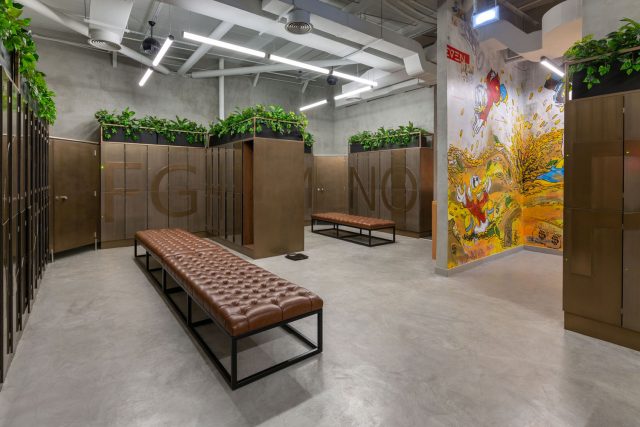
In the changing rooms, EDGE designed a bespoke metal-coated locker, that placed against grey walls define the contrast between raw and polished elements. The tone outside of the changing rooms is broken down by colorful wall artwork with cartoon characters.
The First floor dedicated to the light training divides into smaller workout spaces, separated by lightening passageways. The work out areas are very straightforward and intuitive to the user and don’t require any signage. The cardio machines are positioned at a higher wooden podium, overlooking Burj Al Arab.
